Workspace orbtk_core
Application
The application crate provides the base api inside an OrbTk application.
Its elements are consumed via dedicated modules organized in the other sub-crates.
The ContextProvider
This structure is a temporary solution to share dependencies inside an
OrbTk application. Right now, if the app is started, a new
ContextProvider object is created. The interconnection between
sender and receiver are handled using asynchronous channels with
sender/receiver halves (mpsc).
-
window_sender A
WindowRequestis used to send the given request to the named window. -
shell_sender A
ShellRequestis used to send the given request to the application shell. The application shell is aware of the handled windows. They are differenciated via individualWindowAdapterobjects.
In the given version this module isn’t thread save. It will be refactored in the next upcoming release.
The WindowAdapter
Each WindowAdapter handles its unique tree, event pipiline and
shell. They are dynamically stored in the undelying DCES via ECM
methods.
The shell will react on UI events. The code for dedicated events are organized in explicit modules that will trigger their handlers:
- activation events
- clipboard updates
- drop events
- focus events
- key events
- mouse events
- text input events
- window resize events
- window scroll events
- window system events (like
quit)
The EventAdapter provides a thread safe way to push events to the
widget tree of a window.
The Overlay widget
The Overlay widget allows the handling of children at the top of the
tree. Thus its children will be presented on top of all other widgets
grouped in the widget-tree.
Layout
A layout is used to dynamically order the children of a
widget. Before we can arrange the components on screen, their sizes,
bounds and constraints have to be measured. The ordering process
will result in a parent / child relation (tree), that is represented
and handled in the ECM. In a next step, the tree components are
arranged. The result is rendered into an output buffer. Last not
least the updated areas are signaled to the output screen.
To measure components, the code will provide suitable defaults for
each property as well as a desired_size. The desired_size will
resolve the height and width property of the child element.
This values can either be overwritten with an explicit component
property inside your rust code, or while referencing to definitions
using a style property. Please take into account, that a given
style definition will take precedence over all explicitly defined
property elements inside the code. OrbTk will not respect a mixture of
both declarations.
The absolute placement
Only components with a visibility property that is labeled with a
Collapsed or Visible option will be taken into account, when
calculating bounds and constraints of a child. The resulting bounds are
points, with absolute x and y positions on the screen (floating point values).
New rendering of the child will only occur, if any of its properties is
marked dirty.
The fixed size
A fixed sized layout is defined by fixed bounds for its child. Think of images that have to be rendered with a given size, or a minimum size of a text box.
Grid layout
The grid layout is a specialized case of the default alignment layout. If you declare rows and columns, the child blocks are calculated suming up each individual block bounds inside the corresponding row or column.
You may stretch the blocks to the choosen dimension (horizontal vs. vertical). As a result, if you resize the window of the running app, that grid element will consume the extra size available because of your interactive change. Vice versa, the elements will shrink down until the grid child will reach the defined minimum bound.
Padding layout
Padding may be needed, as a property of a broad range of
components. The measurement cycle will calculate the padding value (a
floating point value) as a constraint that is added to the space
requirements of the associated content component. You may think of the
padding as a surrounding with a given thickness, that is placed
arround your content.
The following image visualizes the dependencies.
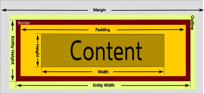
Image 2-2: Layout constraints
Popup layout
The popup layout is a specialized case of the default alignment layout. A popup is typically needed to render content, that is related to a given target widget. That includes the position of the popup itself, as well as its dynamic created content.
You can find a common use case of a popup if you study the OrbTk code
of a list box. The list box elements are collected in a stack
widget. The stack itself is placed in a popup widget. And the
popup widget is placed right below the text block that offers a
drop-down selection arrow.
Stack layout
The stack layout is a specialized case of the default alignment
layout. A stack offers a use case, where you want to place other
widgets in a congruent horizontal or vertical order. You may
define a spacing property. This given floating point value is used
as a seperator between each stack member.
Localization
Localization is a research task by itself, if you want to resolve all syntactic rules that are found when writing prose in different languages. OrbTk’s localization crate isn’t ready to resolve all this complexity, but this may improve in further releases.
Starting with the given implementation, localization can offer methods, that
are able to match and replace text strings. The usage of the localization crate is
optional. If you don’t need any multi lingual adaptions inside your widgets, simply
do not include the localization sugar.
The building blocks of localization
If you want to enable the users to select and change the desired display language of the GUI at runtime, the toolkit needs to match up a requested text strings (the key) that should be presented inside the view and substitute it with the corresponding translation string (the target value). Dictionaries are used to organize the keys as word lists.
OrbTk’s localization implementation has choosen to persitently store
the translation strings inside a RON file. When introducing
the new syntax structure used inside a RON filetype, it was one goal
of the authors to easily match rust types to ron types. That is
exactly the development goal from the RON authors:
“RON is a simple readable data serialization format that looks similar to Rust syntax. It’s designed to support all of Serde’s data model, so structs, enums, tuples, arrays, generic maps, and primitive values.”
You can save each supported language in its individual ron file. The language
files need to be distinctable. A natural way to implement this requirement
is the usage of unique language ids. Most *operating systems take advantage
of a locale subsystem, and save the identification of the active language in
the lang enviroment variable. It’s good practice to include the language id in
the corresponding ron file name.
When you include the localization functionality in your OrbTk code, you
should define constants for each supported language id, that will reference the
ron file in question.
When calling the RonLocalization methods addressing the combination of a language
id and the corresponding dictionary you are able to store the result in language
variable. The crate methods will handle all the heavy lifting to substitute the
source values of the text attributes inside the views with their matching translation
strings in the addressed dictionary.
The ron file structure
In OrbTk, the structure RonLocalizationBuilder is defined to take values for
the following parameters
- language: a String
- dictionaries: a HashMap
The ron filename representing a language localization should include the language identifier to ease its distiction from another.
Dictionaries itself are stored The dictionary is represended by a key value pair
A class Dictionary will include a map named words.
The ron type map is like a type struct, but keys are also values instead of
just beenig identifiers.
- using a ron file
Activation of the localization crate inside your source code boils
down to this short example code.
#![allow(unused)]
fn main() {
static LOCALIZATION_ES_ES: &str = include_str!("../assets/localization/dictionary_es_ES.ron");
}
We do define two language identifiers:
- _de_de: referencing a ron file with german translation strings
- _es_es: referencing a ron file with spanish translation strings
#![allow(unused)]
fn main() {
    Application::new()
        .localization(es_es)
}
When creating the Application block, we do pipe in the localization property. To keep this example simple, a hardcoded de_DE is choosen. The showcase example inside the orbtk source code implements a tab widget, that offers a dropdown list, to dynamically change the active language variant.
#![allow(unused)]
fn main() {
    let es_es = RonLocalization::create()
        .language("es_ES")
        .dictionary("es_ES", LOCALIZATION_ES_ES)
        .build();
    /* disabled german translation file
     * let _de_de = RonLocalization::create()
     *    .language("de_DE")
     *    .dictionary("de_DE", LOCALIZATION_DE_DE)
     *    .build();
     */
}
To compile this example code, go ahead and enter the following comand in your terminal window:
$ cargo run --release orbtk_localization
Your screen should present an application window showing the translated spanish strings.
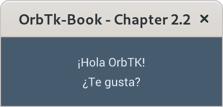
Image 2-2: Application window with spanish localization strings
Sure, this code isn’t elegant nor will it suite the real application
demands. What it does show is the logic, to bind a ron file (storing
the translations of a given language) to a const. When calling
RonLocalization, the text method will resolve text attributes
inside a view or any rust primitive with the translation text resolved
in the language dictionary.
Properties
Every entity that is managed via the provided ECM methods (in most cases this will
be widgets) will have associated components. If we are
talking about components inside the toolkit, we name them properties
of a given object.
Layout
Our aim is a dynamic ordering of objects inside the render buffer. This ordering needs to respect the specific properties of each object making up the object tree. All properties declared for the addressed objects will sum up the constraints that need to be respected within their layout.
Logical units of properties ease the measurement and assignment process of the given object tree.
Blocks
Inside OrbTk the BlockBuilder method handles a block. A block is a
term that defines an object inside the render surface. A legacy form of
the API was using the idiom row or column to define the position
of a block inside a grid widget. We moved on to use blocks as a
generic term that can be used in all widgets. Blocks will inherit
default properties:
- a block size
- its minumum size
- its maximum size
- its current size
If we measure a block size, we can choose from an enumeration of valid expressions:
- Auto: The largest child will be used to measure the block size.
- Stretch: The block will be expanded and consume all of the available size.
- Size: An explicit floading point value.
ScrollViewerMode
To describe the vertical and horizontal scroll behavior of a widget,
we do make use of the ScrollViewerMode. The ScrollViewerMode will
evaluate a valid enumeration value of the ScrollMode. Per default it
will automatically assign the Auto value. That will take care
that the layout logic is able to automatically adjust and manage scroll
movements of associated widget elements (e.g. in ListViews, SelectionViews or TextBoxes).
You may want to handle this scroll movements via your own dedicated
code. Just adapt the mode property horizontal and vertical to your needs and select
ScrollMode::Custom. To completely disable any scrolling logic select
ScrollMode::Disabled.
Widget
FocusState
To offer natural interactivity with the implemented UI, we should
respect workflow standards. E.g a user is expecting the cursor and the
possibility to change a widget element at the next logical
position. Imagine a form, where the UI offers a layout to enter some
address fields. When you activate such a form, you do expect the
cursor position on the first element of the form. Thus, we need the
concept of a Focus that enable the state logic to preset UI
interaction onto a specified element. The FocusState offers methods
to control the state information of widget elements:
- Request the focus for an entity.
- Remove the focus from an entity.
- Reference the current focused entity.
- Check the focus state of an entity.
KeyboardState
The keyboard state tracks which keys are currently pressed. The active state is stored in a lazy-loaded HashMap.
Beside common key activities, you may need to react on generic
modifier keys (Alt, Ctrl, Hyper, Shift). Helper functions
offer several convenience methods to handle such keyboard events. A
generic method comes in handy, if you don’t care which modifier key is
down (Shift-left or Shift-right => Shift). The example section
will also tackle the case, where a combined event (Ctrl+S) keyboard
state is handled.